The fastest way to make an MVP dashboard confusing is to begin with components before defining the decisions it must support. A useful dashboard makes status visible, turns data into action, and gives each role a clear next step.
Start with the user role and the decision.
Before designing cards, charts, tables, or filters, define who is using the dashboard and what decision they need to make. A founder, operator, finance lead, support team, and field manager will read the same data differently.
A good MVP dashboard may serve only one or two roles at first. That focus is useful. It keeps the interface from becoming a general reporting wall and helps the team prioritize the information that changes behavior.
Separate signal from archive.
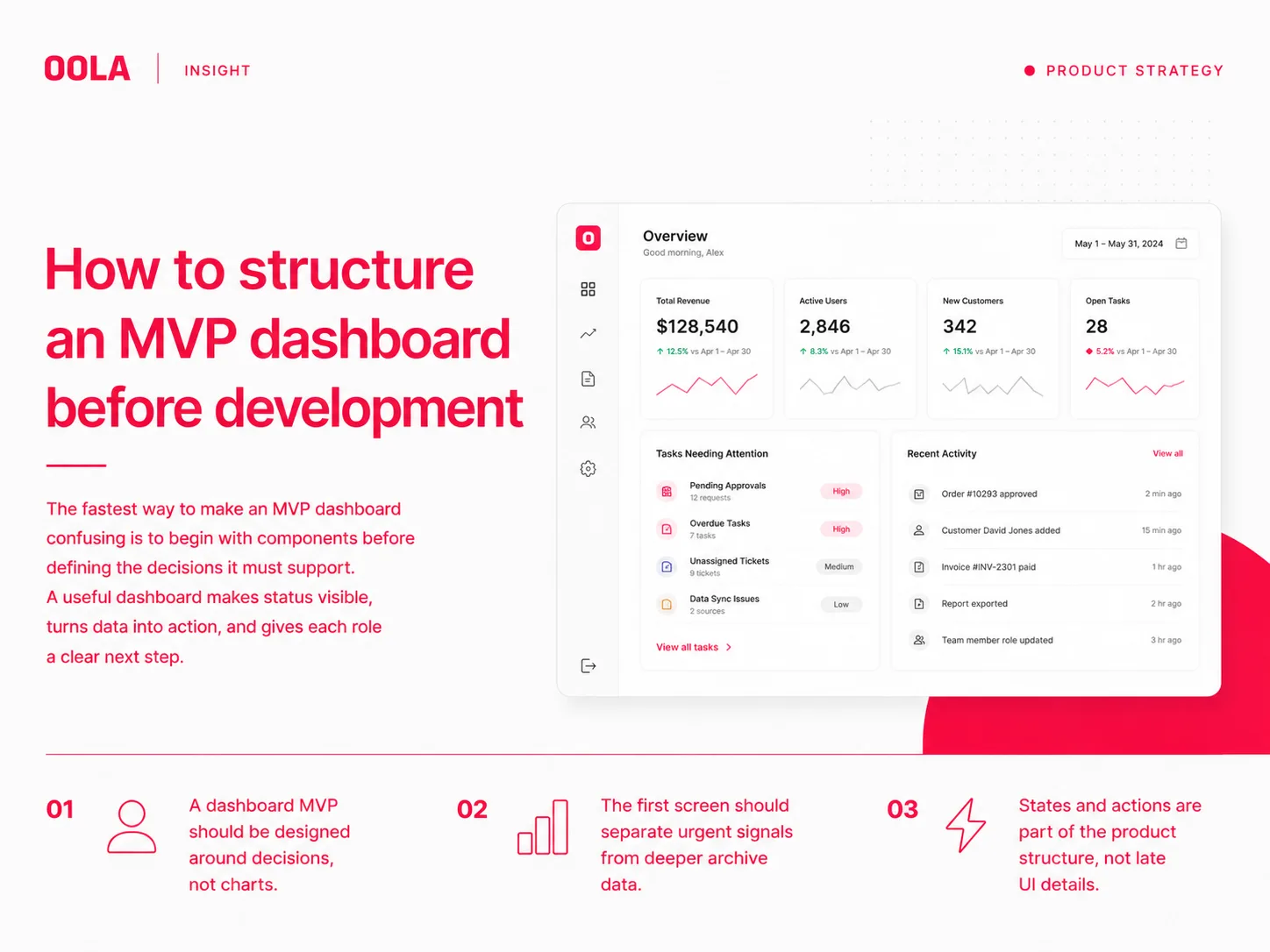
Dashboards often fail because they show everything with equal weight. MVP dashboards need a stronger hierarchy: what requires attention now, what changed recently, what needs review, and what belongs in deeper reports.
The first screen should not become a storage unit for every metric. It should work like an operational overview. If a user cannot explain what needs attention after a short scan, the hierarchy is not clear enough.
Design states before edge cases become bugs.
A dashboard is full of states: loading, empty, partial data, errors, permission limits, overdue items, archived records, and completed workflows. These states should be planned before development because they shape both the interface and the backend contract.
For an MVP, state planning does not need to be exhaustive. It needs to cover the moments that would otherwise block a user or make the product feel unreliable.
Define the action model.
A dashboard that only displays information may still be useful, but many operational products need action. Users may need to approve, assign, export, comment, escalate, edit, or open a detailed view.
The action model should be simple at MVP stage. Decide which actions happen inline, which happen on a detail page, and which should be postponed until later. This prevents the first release from becoming overloaded.
Key Takeaways
A dashboard MVP should be designed around decisions, not charts.
The first screen should separate urgent signals from deeper archive data.
States and actions are part of the product structure, not late UI details.